Organizing Complex Information
Every design project is an opportunity to gain understanding, simplify complexity, and improve messaging.
CLIENT:
Microvision
DATE:
Nov 2005
PROJECT:
Organizing Complex Information
Organizing complex information can improve customer experiences while also smoothing business operations and expanding opportunities. Current and prospective customers face complexity as they encounter and use products and services or navigate new spaces.
Travel Example
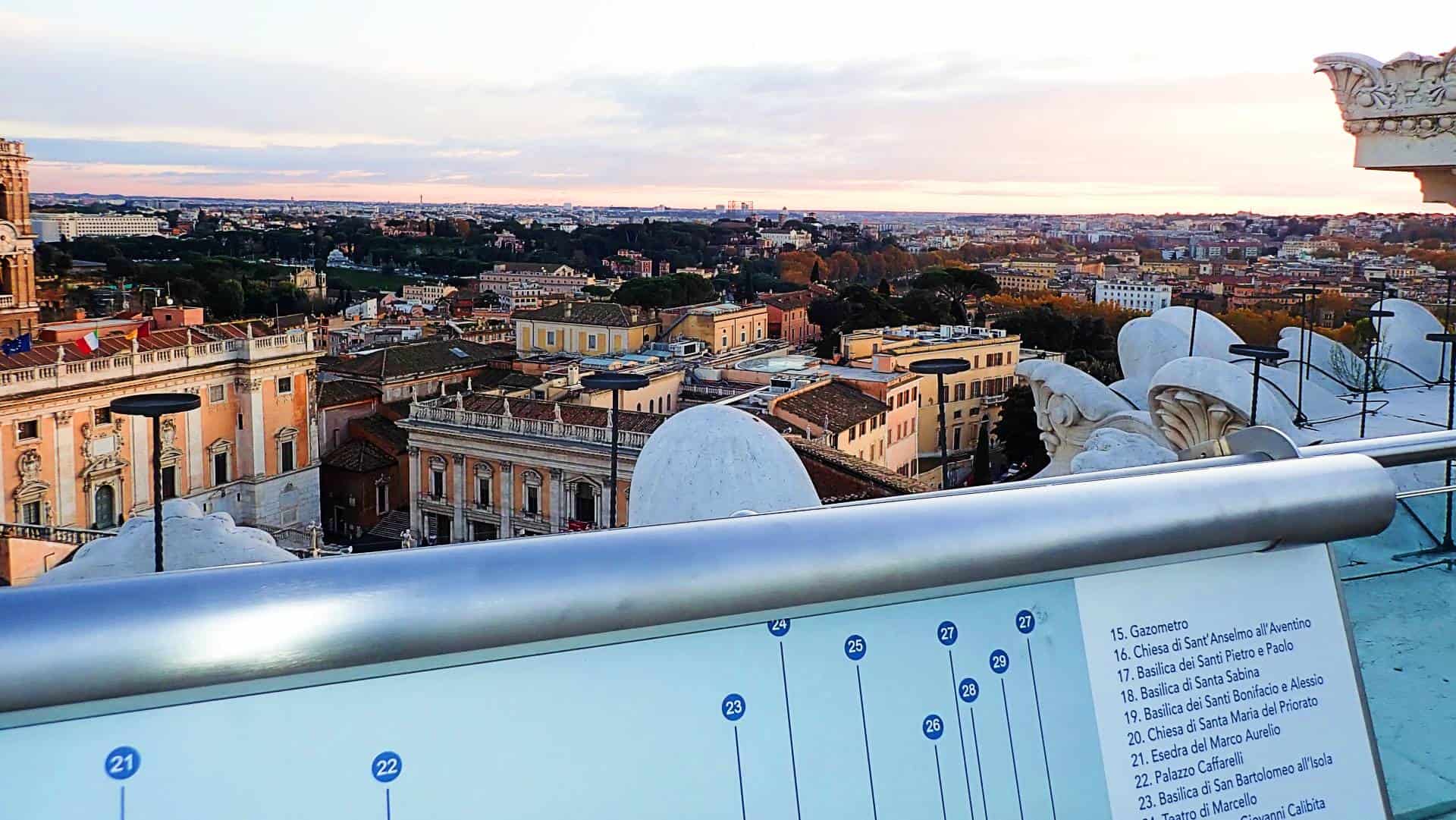
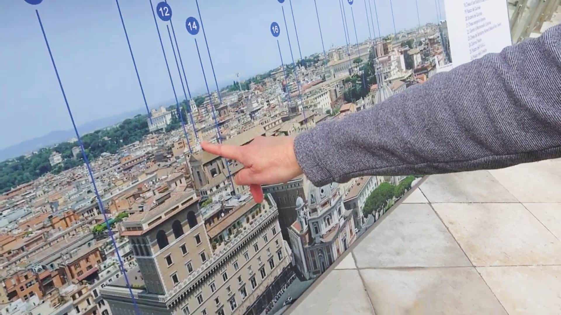
A first time visitor to Rome may visit the Monument to Victor Emmanuel II. On top of the monument, at a height of seventy meters, is a panoramic terrace that offers visitors a breath-taking 360° view over the entire city of Rome. A view information panel contributes to the overall design of the space, promoting a better connection between people and the surrounding environment.
Products Are Like Strange Cities
When people visit a new place they may feel disoriented or unsure about what they are seeing. Orientation panels provide context and help users get their bearings straight, so they can better comprehend the layout of the area and identify landmarks. Likewise new products and services can be dizzying. Organizing complex information can help users get their bearings straight as they encounter new products and services for the first time or use them each subsequent time. This makes a more informed, engaged and enjoyable experience for customers and visitors alike.
Microvision Business Challenge
Microvision’s Flic Scanner business was not performing as expected even though thousands of scanners had been sold. Many scanners were sold through the company’s e-commerce storefront. Little was know about these purchases beyond the customer name and shipping address. We needed to embark on a fact-finding mission if we were going to grow the business.
Business Knowledge Needed:
- How were customers using the products?
- Which software application(s) they were scanning bar codes into?
- Which devices and operating systems were being used?
- Were there opportunities to bundle products?
- Were there opportunities to find new resellers?
- How was the software development kit for developers performing?
New Collateral Design Needed
One of the goals in designing new collateral was to improve communications internally and with future customers and channel partners. This would be important for upcoming tradeshows within the Microsoft mobile community and the RIM BlackBerry ecosystem as well as other developing mobile ecosystems.
Shared Understanding and Common Language
A formidable challenge to designing new collateral, acquiring new customers, attracting channel partners, and growing the business was language. Even though team members were using the same language there was semantic ambiguity around certain terms such as software. Did software mean firmware to make the bar code scanner function? Or, software drivers? Or, did it refer to a software development kit for engineers to integrate the scanner into their application software? Or, did software refer to software applications. Without a shared understanding and common language conversations quickly devolved. We needed to build a common language and shared understanding around the term software.
Results
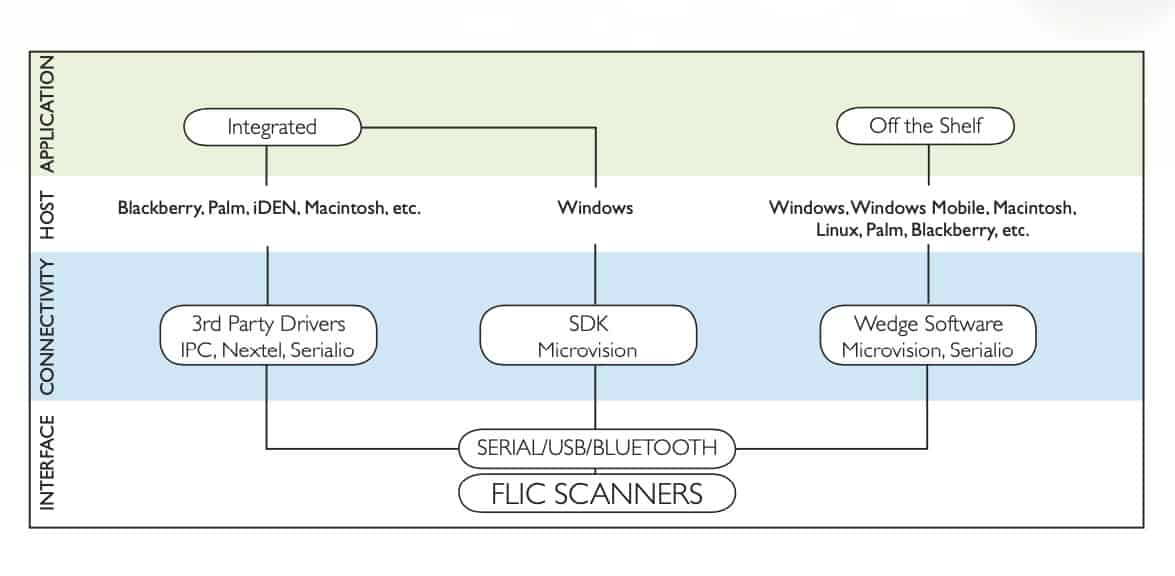
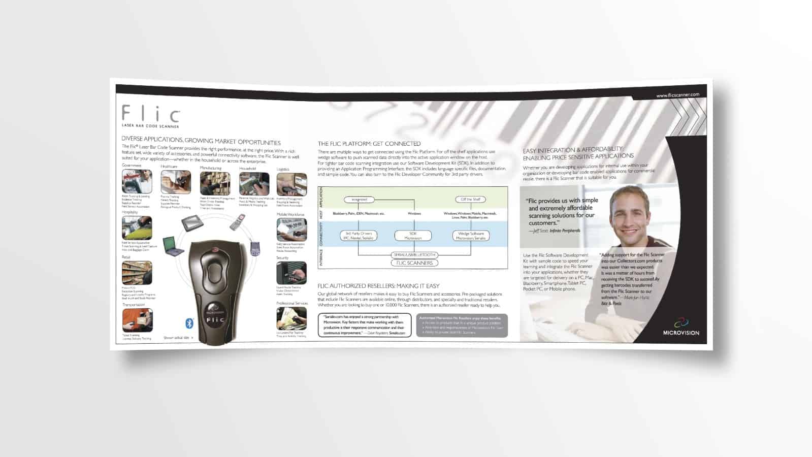
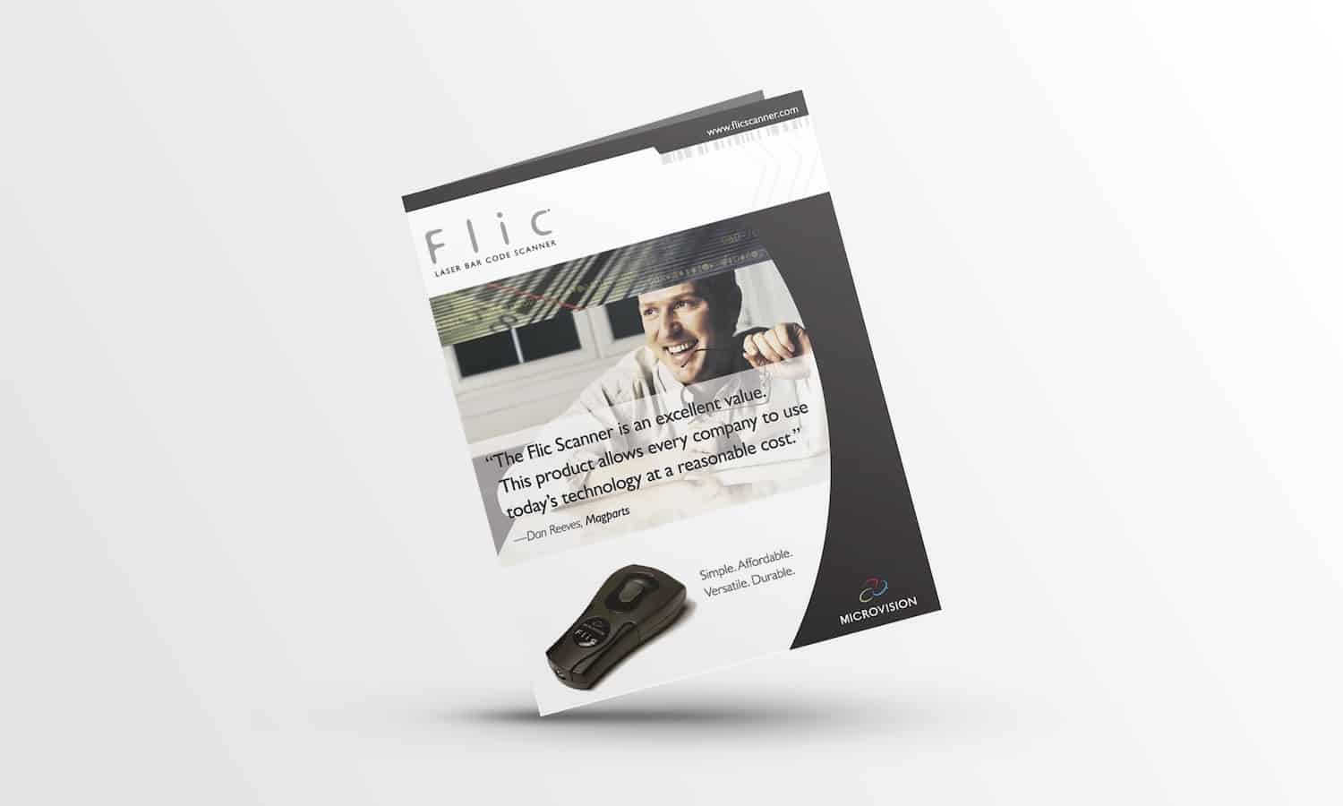
What began as a brochure redesign ended up being much more. This Flic Platform Diagram became a key reference visual to orient customers, developers, resellers, and integrations partners. It was helpful in establishing the much needed common language around the term, “software” and created a shared understanding among engineering, sales, marketing, and services. Designing a new brochure demystified product usage for future customers and resellers.
Organizing Complex Information Expanded Opportunities
Having the Flic Connectivity Platform diagram enabled more productive conversations internally as well as externally with developers and resellers. The brochure architecture became a foundational piece for new collateral as the scanner product line continued to innovate. The ROV MEMS-based scanner used the same basic format. Solutions collateral also mirrored the information design that resulted from this project. An online solutions guide was created to showcase even more detail about each software application. Product bundles became a reality once internal and external stakeholders were able to communicate more effectively.
We Designed More than a New Brochure
We embarked on a fact-finding mission. One source of learning was a loyalty campaign where we reached out to customers to ask many questions. See What’s Your Story. Other sources of information included call center reports, technical requests made to the applications engineer, and interviews with channel managers and resellers. Independent Software Vendors and Resellers who offered integration services were especially helpful to inform the product roadmap.
Simplifying Complexity by Organizing Complex Information
From this information, a connectivity diagram was beginning to take shape. Creating a visual communication tool helped us to have better conversations with various stakeholders. The final version is what appears on the inside middle panel of the tri-fold six-panel brochure.
